FILM POSTER

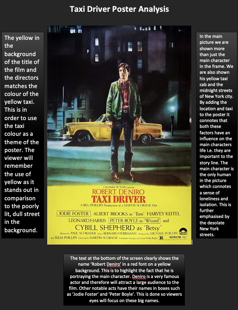
Off The Leash Film Poster


Analysis                                                                                                                                                    

I created my film poster by using Adobe Photoshop and Adobe Lightroom. I knew I wanted to have a man wearing an animal mask as the central image of my poster. This is because it introduces the audience to a main antagonist and clearly portrays the character as a villain. The fact the man is holding a hammer also poses as a threat and immediately shows the audience the genre of the film, horror.

My poster is made up of a darker colour palette, with shadows and exposure in order to create an eery atmosphere. I created the red background effect on Adobe Lightroom as I felt it would add a sinister effect to my poster. Red as a colour has connotations with danger and warning. This further highlights the genre of the film.
The font I used is called Shock Therapy and is a downloadable font we found online. The font's rough edges work well for the films title, release date and tagline as it shows the genre of horror/thriller. I also downloaded the billing block font which worked well when I was making my billing block.

Finally, I carried out research on tag lines from different horror films. This allowed me to take inspiration and come up with ideas from other relevant films. I felt like 'you were warned...' worked well for my film as it is not specific and does not give away too much information about the film. It indicated that something goes wrong in our film and encourages audiences to watch.

Process

I created my film poster using Adobe Photoshop and Adobe Lightroom. The process was relatively long as I had to go into great detail at several different occasions. I had to teach myself how to use the applications as I had no experience using either apps before. I would say I learnt relatively quickly and managed to produce a realistic poster which successfully portrays our genre and vibe.

I wanted to create a poster which highlights the scariness and severity of our group of antagonists, The Transparent Animals. After school one day I went to the woods with my dad where we took a selection of photos of the trees and me wearing my goat mask. Some turned out good and others not so good. After reviewing all the photos I picked the one I liked best and began to edit it on Adobe Lightroom.

Original photo

I chose to use Adobe Lightroom to edit my photo as it is easy to use and offers a wide range of filters and effects that I could use when customising my initial image. I edited the features of my image such as the shadows, exposure and added a red effect over the sky and trees. I was happy with the red effect I was able to create as it added a sinister and scary ambience to my poster which fit with our horror genre.

Adobe Lightroom

Finally, once my image was edited I dropped it into photoshop so I could begin to overlay my text and make some final adjustments. I used the 'Shock Therapy' font for my poster as its rigid corners and serious undertone emphasise our horror genre. One change I had to make to my poster was removing the logo that was visible on my shirt. This was simple as I just had to take a brush and apply some black over the white logo, making it invisible.

Adobe Photoshop

Finally, once I was happy with the way my poster was looking (the font, the background and the central image), I began to make some final adjustments. After looking at my first draft I realised that the central image was being obstructed by my film title. It is important that the central image of a poster stands out and attract attention, therefore I felt it was necessary to swap the places of the film title and tagline. This was an easy change to make as I just swapped the places of the two texts on my canvas. I was felt that the poster looked much better this way as the head section of my central image was no longer being obstructed.

Another final adjustment I had to make was making the size of the billing block smaller. This was a necessary change to make as it stops audiences from being drawn to it and focusing on other aspects of the poster such as the central image and film title.


First Draft                                                                   Final Poster


Poster Research


1 comment:

  1. MINOR TASK: POSTER
    You have conducted relevant research which you present in an appropriate visual format. Your research shows detailed articulate reflection and confident knowledge of genre conventions, which you have mostly applied in your own work; early drafts of your poster reflected the need to how to integrate the main image in the layout and where to place of text. Your centre of visual interest features one of the masked men against a fiery forest backdrop, which is dramatic and does signal the genre and narrative, but risks being a little hard to interpret precisely. Your font choices work effectively and other genre codes and conventions are met.

    ReplyDelete

PROMO PACK BRIEF

Ben Richardson 1853 I worked with Sam De Bruin 1815, Matt Heyns 1828 and Finn Hanley 1824. Our brief was to make a promo package, consisting...